|
July 23, 2026
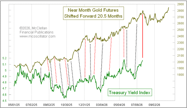
This week's chart is one that I show in almost every issue of our twice month McClellan Market Report. It shows how the movements of gold prices tend to get echoed again (imperfectly) 20-1/2 months later in the movements of long term interest rates.
The Treasury Yield Index represents the current yield to maturity on whichever is the most recently issued 30-year Treasury bond series. I could substitute the 20-year yield in this chart, and it would look similar. The key point is that liquidity waves which ripple through the financial markets tend to hit gold first, and then proceed to other markets afterward. For reasons I do not know, the lag time for those waves reaching the bond market is about 20-1/2 months.
Gold was making a big spike top 20-1/2 months ago, and so the expectation is that the current big rise in interest rates should be peaking right about now. I could calculate the specific date, but that would create a misleading impression about the precision of this relationship. It is not as time-precise as I would like, and it goes through periods when the turns in yields arrive a bit earlier than scheduled, and then in a few weeks they are later than depicted. This is the normal relationship, and 20-1/2 weeks is just the lag time that gets the best overall fit.
This model also does not tell us about the magnitudes of the moves as well as we might like. The dance steps are very similar, but the magnitudes can be a lot different. That is just the nature of this model.
And that is an important point to remember. 20-1/2 months ago, gold prices were topping just underneath $2800/oz. Gold then went on to nearly double in value by the January 29, 2026 peak at $5508. This does NOT mean that the numerical bond yields are necessarily going to double from here. It does not work that way. But there should be some noticeable response.
First, though, bond yields are scheduled to match the violent sideways chop which gold's pattern shows. That sideways period should last into mid-September, and then the big rise in yields is scheduled to start.
Tom McClellan
Editor, The McClellan Market Report
www.mcoscillator.com
|